%20--%3e%3cdefs%3e%3cstyle%3e%20.st0%20{%20fill:%20%23061b40;%20}%20.st1%20{%20fill:%20%23306af1;%20}%20.st2%20{%20fill:%20%235ce5cf;%20}%20%3c/style%3e%3c/defs%3e%3cg%3e%3cpath%20class='st0'%20d='M55,10.5h9v3h-9v9h12V7.5h-12v3ZM64,19.5h-6v-3h6v3Z'/%3e%3cpolygon%20class='st0'%20points='69%2016.5%2078%2016.5%2078%2019.5%2069%2019.5%2069%2022.5%2081%2022.5%2081%2013.5%2072%2013.5%2072%2010.5%2081%2010.5%2081%207.5%2069%207.5%2069%2016.5'/%3e%3cpolygon%20class='st0'%20points='95%2010.5%2095%207.5%2083%207.5%2083%2022.5%2095%2022.5%2095%2019.5%2086%2019.5%2086%2016.5%2095%2016.5%2095%2013.5%2086%2013.5%2086%2010.5%2095%2010.5'/%3e%3cpath%20class='st0'%20d='M40,1.5v21h11.6l1.4-1.4v-7.6h0c0,0-1.4-1.5-1.4-1.5l1.4-1.4V2.9l-1.4-1.4h-11.6ZM50,19.5h-7v-6h7v6ZM50,10.5h-7v-6h7v6Z'/%3e%3c/g%3e%3cpath%20class='st1'%20d='M23.1,24L14.7,4.8l-4.9,11.2h3.8l-1.8,4H3.3L12.1,0H2C.9,0,0,.9,0,2v20c0,1.1.9,2,2,2h21.1Z'/%3e%3cpath%20class='st2'%20d='M34,0h-16.8l10.6,24h6.2c1.1,0,2-.9,2-2V2C36,.9,35.1,0,34,0ZM32.5,20h-4V4h4v16Z'/%3e%3c/svg%3e)

21st
Overview :
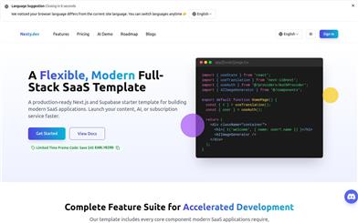
21st.dev is an open-source community registry for React UI components where anyone can publish minimal Tailwind & Radix UI components, which can be installed using npx shadcn commands. Inspired by shadcn/ui, it aims to provide design engineers with a vast marketplace of components, modules, and hooks.
Target Users :
The primary target audience is design engineers and front-end developers who need to quickly and efficiently integrate high-quality UI components into their projects to enhance development efficiency and user experience. For developers looking to use Tailwind and Radix UI in their projects, 21st.dev offers a rich library of components that can save a significant amount of time and effort.
Use Cases
Developers can find and install components like shadcn/ui/accordion on 21st.dev to quickly add interactive accordion effects to their web projects.
Design engineers can publish their own Tailwind theme components for sharing with other developers, promoting community growth.
Front-end teams can leverage components on 21st.dev to rapidly build prototypes, accelerating the product design and development process.
Features
Supports Pure React components, Next.js client components, TypeScript, Tailwind themes with custom configuration, custom global CSS styles, Radix UI, and other npm dependencies.
Allows users to quickly install components using a simple npx shadcn command, automatically creating necessary files and extending the Tailwind theme.
Provides detailed documentation and installation guides to help users get started quickly.
Encourages the publishing of TypeScript components, although JS support is currently untested.
Boasts an active open-source community where users can freely contribute components and collectively advance the project.
How to Use
1. Visit the 21st.dev website and browse the available components.
%20--%3e%3cdefs%3e%3cstyle%3e%20.st0%20{%20fill:%20%230080ff;%20}%20%3c/style%3e%3c/defs%3e%3cpath%20class='st0'%20d='M16.2,11.1c.4.5.4,1.2,0,1.8l-4.7,7.1h-3.8l5.3-8L7.6,4h3.8l4.7,7.1Z'/%3e%3c/svg%3e)
2. Select the desired component and copy the corresponding npx shadcn command.
3. Run the command in the root directory of your project to automatically install the component and its dependencies, while extending the Tailwind theme accordingly.
4. You can further customize the component's styles and behaviors as needed.
5. Integrate the component into your project and start using it.


Featured AI Tools
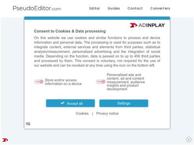
Pseudoeditor
PseudoEditor is a free online pseudocode editor. It features syntax highlighting and auto-completion, making it easier for you to write pseudocode. You can also use our pseudocode compiler feature to test your code. No download is required, start using it immediately.
Development & Tools
3.8M

Coze
Coze is a next-generation AI chatbot building platform that enables the rapid creation, debugging, and optimization of AI chatbot applications. Users can quickly build bots without writing code and deploy them across multiple platforms. Coze also offers a rich set of plugins that can extend the capabilities of bots, allowing them to interact with data, turn ideas into bot skills, equip bots with long-term memory, and enable bots to initiate conversations.
Development & Tools
3.8M