%20--%3e%3cdefs%3e%3cstyle%3e%20.st0%20{%20fill:%20%23061b40;%20}%20.st1%20{%20fill:%20%23306af1;%20}%20.st2%20{%20fill:%20%235ce5cf;%20}%20%3c/style%3e%3c/defs%3e%3cg%3e%3cpath%20class='st0'%20d='M55,10.5h9v3h-9v9h12V7.5h-12v3ZM64,19.5h-6v-3h6v3Z'/%3e%3cpolygon%20class='st0'%20points='69%2016.5%2078%2016.5%2078%2019.5%2069%2019.5%2069%2022.5%2081%2022.5%2081%2013.5%2072%2013.5%2072%2010.5%2081%2010.5%2081%207.5%2069%207.5%2069%2016.5'/%3e%3cpolygon%20class='st0'%20points='95%2010.5%2095%207.5%2083%207.5%2083%2022.5%2095%2022.5%2095%2019.5%2086%2019.5%2086%2016.5%2095%2016.5%2095%2013.5%2086%2013.5%2086%2010.5%2095%2010.5'/%3e%3cpath%20class='st0'%20d='M40,1.5v21h11.6l1.4-1.4v-7.6h0c0,0-1.4-1.5-1.4-1.5l1.4-1.4V2.9l-1.4-1.4h-11.6ZM50,19.5h-7v-6h7v6ZM50,10.5h-7v-6h7v6Z'/%3e%3c/g%3e%3cpath%20class='st1'%20d='M23.1,24L14.7,4.8l-4.9,11.2h3.8l-1.8,4H3.3L12.1,0H2C.9,0,0,.9,0,2v20c0,1.1.9,2,2,2h21.1Z'/%3e%3cpath%20class='st2'%20d='M34,0h-16.8l10.6,24h6.2c1.1,0,2-.9,2-2V2C36,.9,35.1,0,34,0ZM32.5,20h-4V4h4v16Z'/%3e%3c/svg%3e)

Rive Layouts
Overview :
Rive Layouts is a new feature introduced by Rive that enables designers and developers to create dynamic, production-ready graphics suitable for any screen size or device. It combines the principles of dynamic design with responsive web design while retaining Rive's signature smooth animations and interactivity. The significance of Rive Layouts lies in its ability to allow designers to create responsive designs that adapt to different devices and languages without sacrificing creativity.
Target Users :
The target audience consists of designers and developers, especially professionals who need to create cross-platform, responsive graphics and animations. Rive Layouts is ideal for them as it provides an intuitive tool that easily adapts to different screen sizes and devices while maintaining animation quality.
Use Cases
Create a responsive menu for a car dashboard that can also be used on a smartphone.
Design a UI component that automatically resizes for different language contexts.
Build a graphical interface that transitions smoothly between devices, such as from a car dashboard to a smartphone.
Features
Dynamic resizing menus: Build graphics that fit anywhere. With intuitive controls, automatically adjust graphic position, size, padding, and margins—all achieved through Layouts, enabling objects to stretch, shrink, or realign based on screen size without losing animation effects.
Cross-device functionality: Graphics can transition smoothly between car dashboards and smartphones.
Multi-language support: Create graphics that automatically resize to accommodate different languages. No need to worry about text fitting; Rive Layouts handles it all.
Scalable design systems: Build reusable components that adapt to any screen size, ensuring consistent design across all platforms.
Deep nesting and flexibility: Combine alignment, wrapping, and spacing options to create layouts that adapt to the most complex use cases.
Breakpoints: Detect component width, height, or aspect ratio to trigger different states within Rive's state machine.
How to Use
1. Access the Rive editor and log in or register for an account.
%20--%3e%3cdefs%3e%3cstyle%3e%20.st0%20{%20fill:%20%230080ff;%20}%20%3c/style%3e%3c/defs%3e%3cpath%20class='st0'%20d='M16.2,11.1c.4.5.4,1.2,0,1.8l-4.7,7.1h-3.8l5.3-8L7.6,4h3.8l4.7,7.1Z'/%3e%3c/svg%3e)
2. Create a new project or open an existing one within the editor.
3. Utilize Rive's tools and features to design your graphics, including adding animations and interactivity.
4. Enable the Layouts feature and adjust the layout and animations of the graphics as needed to fit various screen sizes and devices.
5. Use the breakpoint feature to detect component width, height, or aspect ratio, and set animations and behaviors for different states.
6. Preview your design to ensure it works well across different devices and screen sizes.
7. Export your design in Rive format for use across various platforms and devices.
8. Integrate Rive graphics into your application or website to enjoy responsive and dynamic design effects.
Featured AI Tools
Chinese Picks
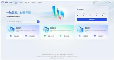
Douyin Jicuo
Jicuo Workspace is an all-in-one intelligent creative production and management platform. It integrates various creative tools like video, text, and live streaming creation. Through the power of AI, it can significantly increase creative efficiency. Key features and advantages include:
1. **Video Creation:** Built-in AI video creation tools support intelligent scripting, digital human characters, and one-click video generation, allowing for the rapid creation of high-quality video content.
2. **Text Creation:** Provides intelligent text and product image generation tools, enabling the quick production of WeChat articles, product details, and other text-based content.
3. **Live Streaming Creation:** Supports AI-powered live streaming backgrounds and scripts, making it easy to create live streaming content for platforms like Douyin and Kuaishou. Jicuo is positioned as a creative assistant for newcomers and creative professionals, providing comprehensive creative production services at a reasonable price.
AI design tools
105.1M
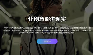
Promeai
PromeAI is powered by a robust AI-driven design assistant and a vast library of controllable AIGC (C-AIGC) model styles. It enables you to effortlessly create stunning graphics, videos, and animations, making it an indispensable tool for architects, interior designers, product designers, and game & animation designers.
AI design tools
6.5M